
By Robert Hokin, Managing Partner, Fundraising101
One-pagers are overrated. Let’s go further than that. As a first investor touch, your one-pager is now close to the worst format you can send.
I’ve evaluated thousands of pitches, first from inside venture capital funds, now across the 500 plus ventures I have coached before and during Fundraising101 and have been on the receiving end of more cold one-pagers than I can count. So let me tell you exactly what happens to yours.
How an investor actually receives your materials
Picture it. Your investor is not at a desk with two monitors and a coffee. They’re on their phone, between meetings, or in the back of a taxi. Your email lands and they tap it open.
That’s not me guessing. Most email now gets opened on a phone. Industry tracking puts mobile at roughly 55 percent of all email opens, and that share has held steady for years (MailerLite, drawing on Litmus data). Your first impression is being formed on a five-inch screen held in one hand.
So they open your one-pager and what they see is a wall of compressed text, tiny fonts, and a layout that was obviously built for a desktop. They pinch to zoom. They scroll sideways. They squint at it for about ten seconds, and then they close it. Not because your company’s bad. Because the format actually made it painful to find out whether your company’s GOOD.
You didn’t lose on the merits. You lost on the format.
The deeper problem, even on desktop
Now say the investor is at a desk. The one-pager still has a structural flaw it can’t escape. It tries to do everything on one page, which means nothing on it gets enough room to land.
Your problem gets one or two sentences. Your traction is a single row of numbers with no context. Your team is four headshots and a list of titles. There’s no space for context and no space for any single idea to feel convincing on its own. Every point fights every other point for the same square inch.
Remember how little time you have to get your message across. DocSend, which tracks how investors interact with real fundraising materials, finds that investors on average spend just 3 minutes, 44 seconds reviewing a seed pitch deck, and only 58 percent of decks are read all the way to the end. Under four minutes of attention, and half your readers never reach the last slide. A cramped one-pager spends that budget badly. It asks the investor to do the work of decompressing your story, in the exact moment they’ve decided whether to keep reading.
The intention is right. The format is wrong.
Here’s the thing. I agree with the instinct behind the one-pager. You want something short. You want to respect the investor’s time. You want a clean first touch that doesn’t dump a 30 slide deck on someone who has never heard of you. All correct.
But the format’s just wrong for how people consume content in 2026. The goal was right. But the execution fights the reader.
Now what? A teaser deck
I am not the first to make this case, and I want to credit the person who put it cleanly. Duygu Dülger of Deck Studio, who has built pitch decks for more than 200 startups, makes the argument for sending a teaser deck rather than a one-pager because it “feels intentional, not compressed.” I agree.
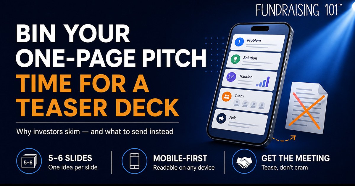
Five or six slides. One idea per slide. Nothing more.
Why it works better:
- Readable on any device, and most importantly on the phone where your investor will first see it
- Each slide gets enough visual space to actually breathe
- One idea per slide means every point lands on its own instead of competing for attention
- An investor can swipe through the whole thing in under a minute, which is roughly all the time you are going to get
- It feels intentional and considered, not crammed and compressed
Problem. Solution. Traction. Team. Ask.
That’s five slides, and it covers everything a one-pager tries to cover. The difference is that each point now has room to make its case. Your traction slide can show the number and the trend behind it. Your team slide can answer the question every investor is silently asking, which is why you, and why now. Worth knowing: DocSend’s data shows the team slide draws more attention than any other, so give it the space it earns.
If any investor is interested after those five or six slides, they’ll request the full deck. That is the whole job of a teaser. And if they’re not interested, cramming everything onto a single dense page was never going to change their mind. You won’t win investors on layout. But you will absolutely lose them.
A note on warm versus cold
While we are talking about first touches, the format’s only half the battle. The other half is how the deck arrives.
Analysis of DocSend’s data shows cold decks, sent unsolicited, get around 2 minutes 31 seconds of attention and convert to a meeting at roughly 3 to 5 percent. Decks that arrive through a warm introduction get over 4 minutes and convert at something closer to 40 to 50 percent (PitchGrade, on DocSend figures). A clean teaser deck through a warm intro is a different animal from a dense one-pager fired into a cold inbox. Get both right.
What this looks like in practice
I’ve seen this play out across very different companies. A deep tech founder raising several million for a complex hardware reactor doesn’t need to explain thermodynamics on slide one of a teaser. They need five slides that earn the meeting where the detail belongs. A London leisure operator raising a few hundred thousand under SEIS and EIS doesn’t need a spreadsheet on the first touch. They need the problem, the unit economics in one clean line, and the ask.
The pattern’s always the same. The founders who get the second meeting are the ones who respected how the investor actually reads, on a phone, in under a minute, with half an eye on the next thing.
Duygu puts the bottom line better than I could: “Stop compressing your story into a format that fights the reader.” Give it room to breathe. Just not too much.
Still sending one-pagers and hoping for the best? There is a better way.
This isn’t just fundraising. This is Fundraising101™.
#GETRAISEREADY
References
- Duygu Dülger, Deck Studio, original post making the case for the teaser deck over the one-pager: https://www.linkedin.com/in/duygudulger/
- DocSend, What VCs really want to see inside your seed deck (3 minutes 44 seconds average review time, 58 percent read to completion, team slide attention): https://www.docsend.com/blog/what-vcs-really-want-to-see-inside-your-seed-deck/
- DocSend, Pitch Deck Metrics (investor time spent benchmarks): https://www.docsend.com/pitch-deck-metrics/
- PitchGrade, What Investors Actually Read in Your Pitch Deck, DocSend Data (cold versus warm deck read time and conversion): https://pitchgrade.com/blog/what-investors-read-pitch-deck-docsend-data
- MailerLite, Email Marketing Statistics (55 percent of emails opened on mobile, citing Litmus): https://www.mailerlite.com/blog/email-marketing-statistics